AAH its so good to be back. i've missed human interaction and doing work.
my feedback thing was terrible, ew. i'm disappointed in myself. ohhh well i'll just have to work harder from now on hummmmhmm
i dont mind. its good to keep busy!
this week me and my group have been researching negativity and disturbia - a tough one, no?
ian & co chose to work with making students aware of the high burglary rates in student areas, which if you think about it...it's quite a valuable study. i didnt realise how unsafe where i live actually is. ohh er.
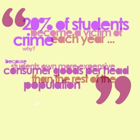
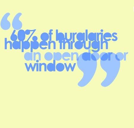
our soultion to our problem was flyers, stickers and maybe a small booklet to inform the public. i think the resolutions of the statistics we displayed today are really nice - we each contributed our own sense of composition and style whilst keeping withing guidelines we had set ourselves
these were:
typeface: century gothic with the kerning set to -75
colour scheme: all shades used had to be taken from specific colour codes e.g. magenta- C878B2 & cyan - 718FC6 ( however we all agreed on replacing the magenta with a darker reddish shade, we also experimented with yellow)
size: A4 - square so 21x21
errm what else. hm i dont think we used any other rules. it's good to have guidelines sometimesssss it makes things that little bit easier
We didnt have time in the end to go out into leeds and hand out our info but we're going to make sure we get some evidence of them being used in the public soon.
i think they look lovely as a set. i think theyre all good pieces visually, but wether they'd work as informiatve resources for the public i'm not so sure.
anyway: you can see them all on our public facebook group: http://www.facebook.com/group.php?gid=43399120949
my group's blogs to see what they have to say about all of this:
http://heatherbradleybagd.blogspot.com/
http://www.ianprenticebagd.blogspot.com/
http://www.leighwortleybagd.blogspot.com/
http://mitchgibbonsbagd.blogspot.com/
i did two resolutions of my own...i also did a few for mitch which looked similar to these..but nicer ha
ooh and we chose a lovely stock which was a good choice. i think on some of them i multipied the layers which made the print quuality look fiiiit yeah
my feedback thing was terrible, ew. i'm disappointed in myself. ohhh well i'll just have to work harder from now on hummmmhmm
i dont mind. its good to keep busy!
this week me and my group have been researching negativity and disturbia - a tough one, no?
ian & co chose to work with making students aware of the high burglary rates in student areas, which if you think about it...it's quite a valuable study. i didnt realise how unsafe where i live actually is. ohh er.
our soultion to our problem was flyers, stickers and maybe a small booklet to inform the public. i think the resolutions of the statistics we displayed today are really nice - we each contributed our own sense of composition and style whilst keeping withing guidelines we had set ourselves
these were:
typeface: century gothic with the kerning set to -75
colour scheme: all shades used had to be taken from specific colour codes e.g. magenta- C878B2 & cyan - 718FC6 ( however we all agreed on replacing the magenta with a darker reddish shade, we also experimented with yellow)
size: A4 - square so 21x21
errm what else. hm i dont think we used any other rules. it's good to have guidelines sometimesssss it makes things that little bit easier
We didnt have time in the end to go out into leeds and hand out our info but we're going to make sure we get some evidence of them being used in the public soon.
i think they look lovely as a set. i think theyre all good pieces visually, but wether they'd work as informiatve resources for the public i'm not so sure.
anyway: you can see them all on our public facebook group: http://www.facebook.com/group.php?gid=43399120949
my group's blogs to see what they have to say about all of this:
http://heatherbradleybagd.blogspot.com/
http://www.ianprenticebagd.blogspot.com/
http://www.leighwortleybagd.blogspot.com/
http://mitchgibbonsbagd.blogspot.com/
i did two resolutions of my own...i also did a few for mitch which looked similar to these..but nicer ha


ooh and we chose a lovely stock which was a good choice. i think on some of them i multipied the layers which made the print quuality look fiiiit yeah

No comments:
Post a Comment